Design Diaries: Cordelia Icon
For a year, Cordelia had an icon I had drawn myself: a cream serif C interlocked with a quill on deep ink-navy. It was a placeholder and it looked like one. So I hired Parakeet — Louie and Luka, a two-person studio — to do it properly. The brief was short. It described what the app does: plain text, live formatting, markdown syntax always visible, no autocorrect, and a serif typeset export. The icon had to feel like the app behaves — minimal, exact, literary. Beyond that, the concept was theirs.
The brief also contained a sentence I wrote quickly and did not examine. The app is early enough in its design lifecycle, it said, that the icon may end up leading the visual identity rather than following it.
That turned out to be accurate.
Two Asterisks#
What came back was two asterisks joined by a bridge. Five layers: each asterisk is a diagonal pair plus a vertical stroke, and a fifth shape connects them. Deep blue on one side, jade green on the other, a gradient running between. It ships as an Icon Composer bundle, so the layers contain their own light, dark, and tinted treatments on a translucent material that picks up the system’s lighting.


The asterisk is markdown’s emphasis character, and in Cordelia it is one of the delimiters the editor deliberately dims so the prose stands out. The mark is built from the character the app spends its whole life rendering. It also stays legible at thirty-two pixels in the Cmd-Tab switcher.
Opening the App#
The icon sat in the Dock next to a window that no longer matched it.
Cordelia’s page was a warm off-white with the blue channel pulled down on purpose, and a comment in the theme file explained why: warmth strengthens the paper metaphor. Underneath, the ink palette carried a second comment saying the ramp was sampled from the old icon’s navy background. Both sentences were true when I wrote them. Neither describes the app anymore.
Three Defaults#
Recoloring was straightforward. The blue in the mark sits three degrees of hue from the old ink ramp, so what really changed was saturation, and the page cooled to match. That took an afternoon.
The interesting result was what became visible once I had something to compare against. Three things, none of them a bad decision:
Blockquotes were drawn in NSColor.secondaryLabelColor, the only markdown element in the editor using a system color. I never weighed it against a theme color. It made the text dimmer and let me move on.
The accent color in the asset catalog was Tailwind’s default blue, which has nothing to do with Cordelia. It tinted every stock control: Settings pickers, checkboxes, focus rings, the find bar. It had been there since the day the project was created.
The Settings window used no theme colors at all. Not the wrong ones. None. A stock grouped form drawing the system’s own backgrounds, fine for exactly as long as the rest of the app was also roughly neutral. Against a cooled page, it read as a different application.
New Colors#
The icon’s two colors now divide the work. Jade marks structure: the # characters on headings, and blockquotes. Blue belongs to the writing surface — the caret, and through the accent asset, every system control in the app. The page is cool at very low saturation, closer to neutral than to actual cyan.
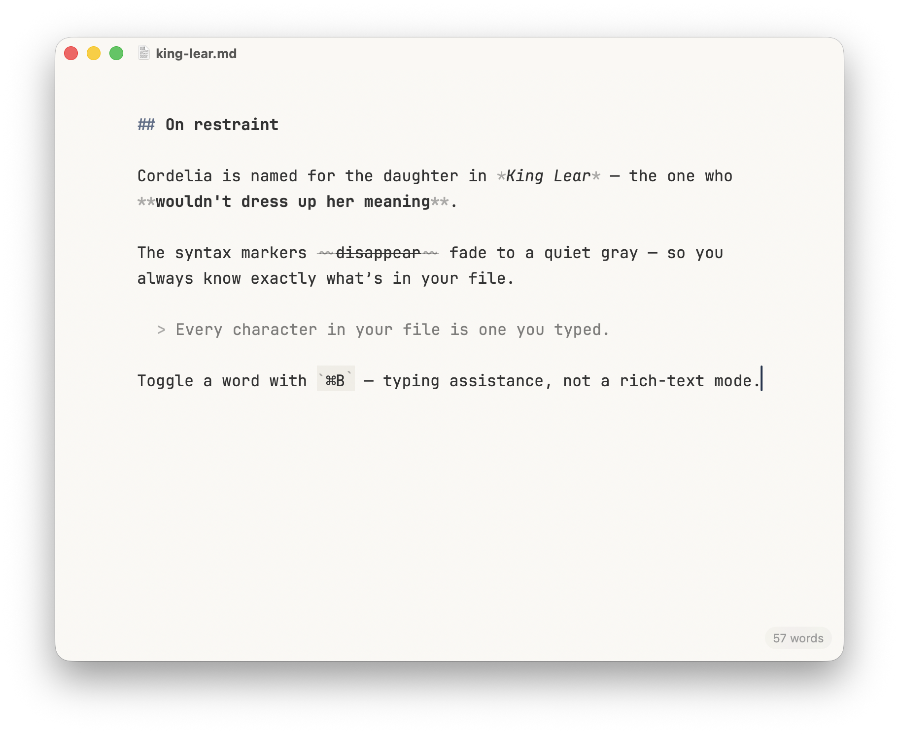
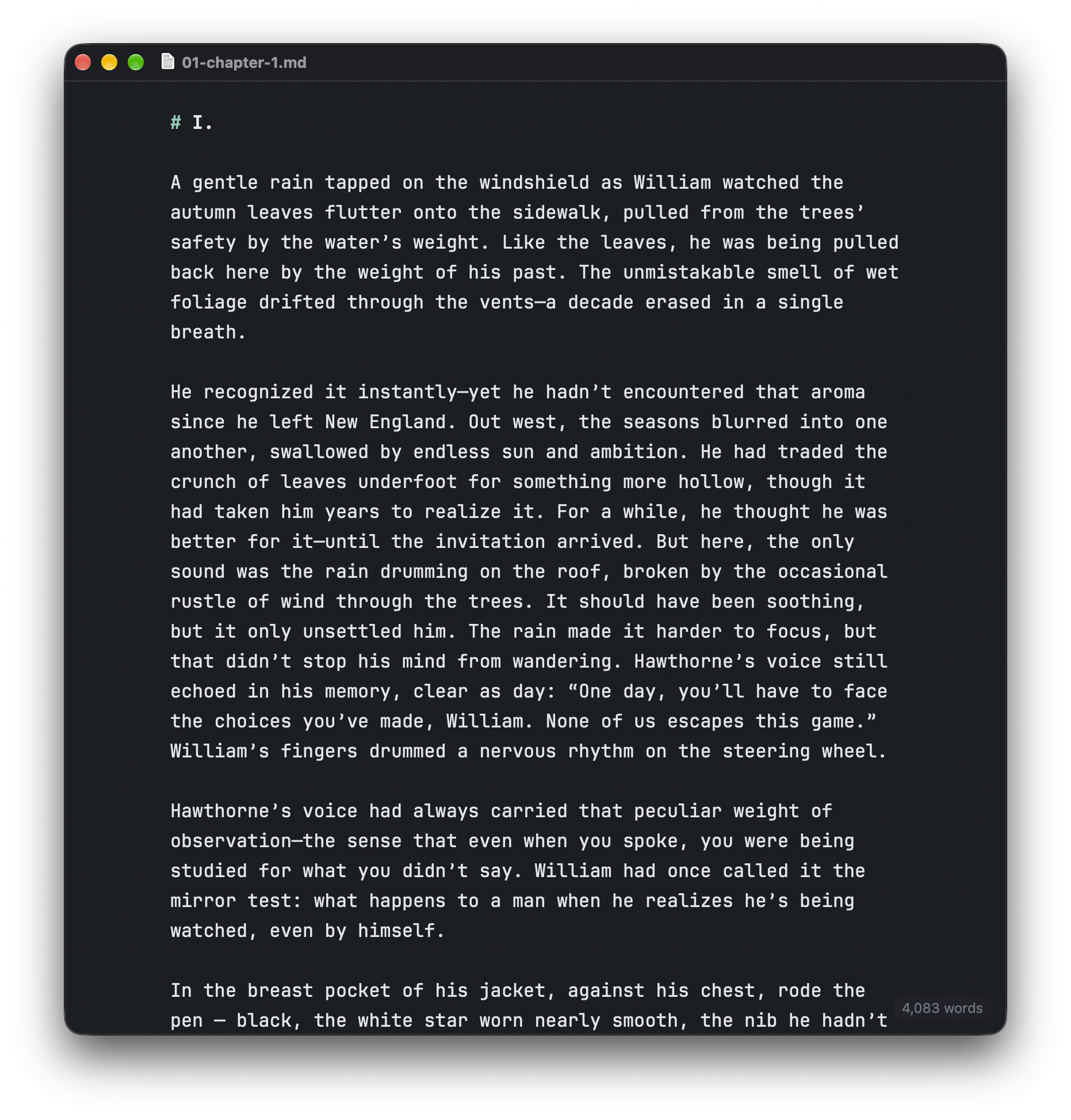
One thing I did not do: step the heading levels along the gradient from blue to jade. The icon has a bridge that does exactly that, and reusing the idea in the UI was tempting. But it would mean the color of a # told you the depth of a heading, and depth is not information the document has any reason to express in hue. Six colors on a page would be busy and tiring. The heading marks fade by opacity, as before.
The new icon ships in 1.0 release next month, and so does the palette it inspired. I asked for an icon. I received a new visual identity.