Cordelia is an app I never expected to make. Its story begins with a death. Just over one year ago, my father died unexpectedly. I needed a project to keep myself occupied while grieving, so I started working on a cross-platform Electron app named Prose. I had already been working on a novel for almost a year, and I never felt at home in any of the text editors I had tried.
The first version of Prose was simple but slightly skeuomorphic. A white page sat above a light gray background with a small drop shadow. It used Avenir as the default font and had a floating formatting toolbar near the top edge of the screen.
The native Mac app named Cordelia bears little resemblance to Prose, but they share a few design principles that have never changed:
- Markdown formatting should recede when editing. Formatting marks should be treated as plain text.
- Thoughtful typography isn’t a luxury — it’s essential for long writing sessions. Your editor should inspire you to write.
- Lightweight doesn’t mean featureless, but every feature must earn its place. The app should be limited to only the tools you actually use while writing a draft.
- The app should never change the characters you type.
That last bullet point remains the bedrock principle I have for any writing app.
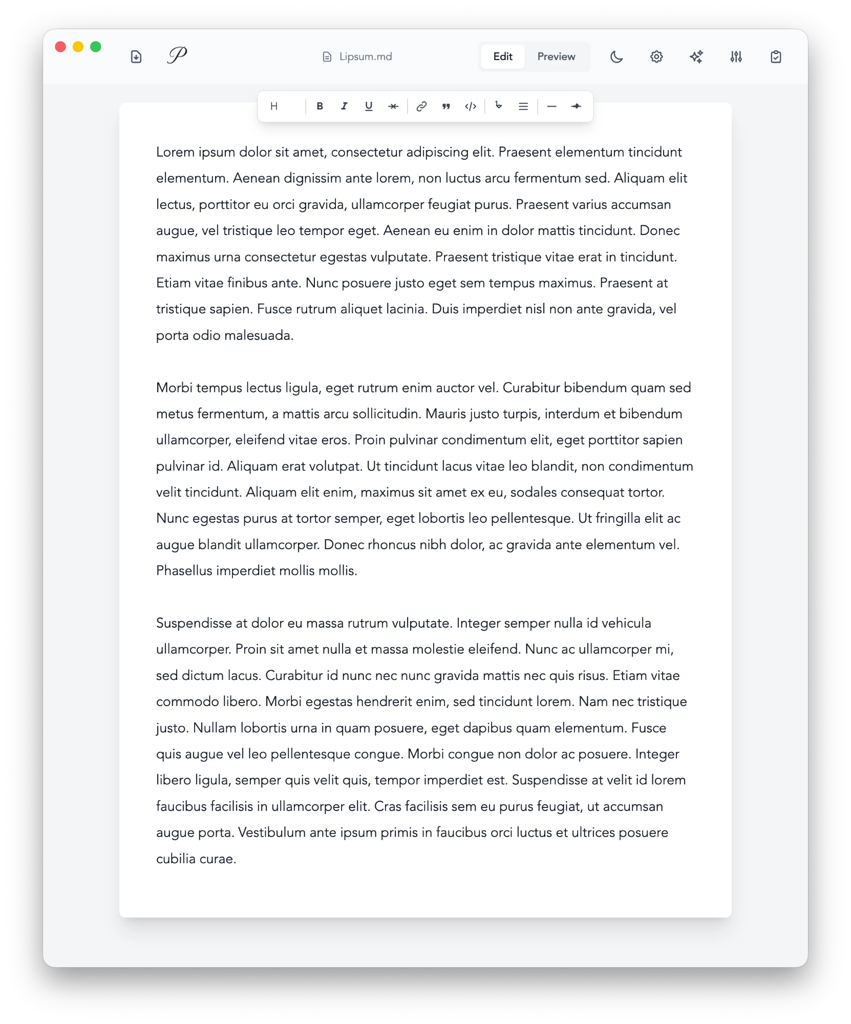
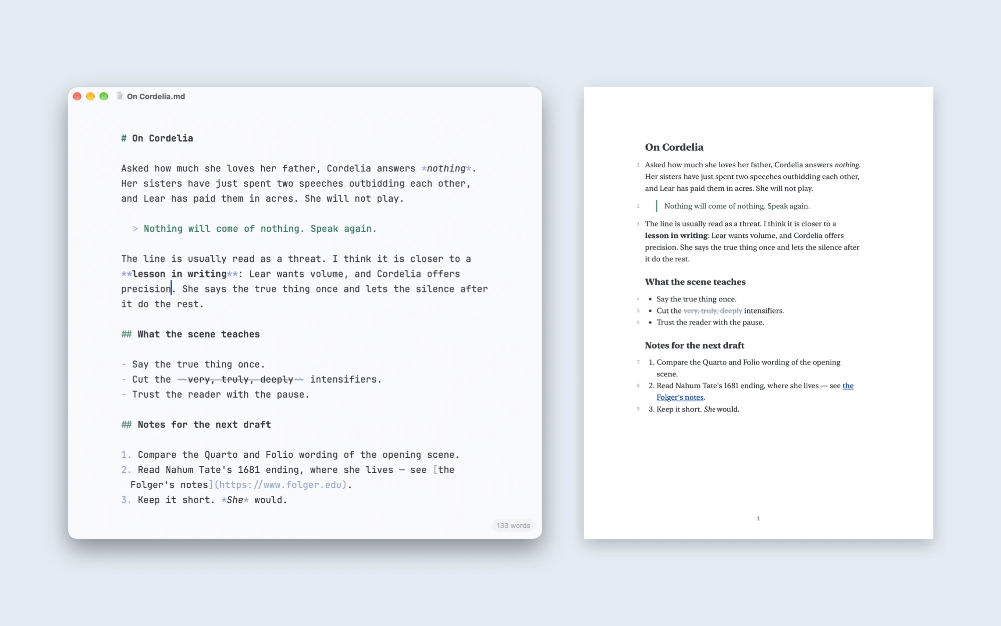
As a React app, Prose never felt at home on macOS. I kept writing in it every day, but I stopped actively developing it. I didn’t touch the repository for three months. I assumed this was how Prose would end: an abandoned GitHub project that would keep running until its dependencies broke one by one.
I had the right values from the start, but Prose fell short of honoring them. Over time, I realized that an app carrying my father’s memory deserved my best work, not my first.
Cordelia is a ground-up rewrite, written in Swift. It is named for the daughter in King Lear. She is unapologetically truthful, even when it works against her. Say less. Mean more.
Every missing feature is a decision, not a gap. Cordelia does not have a floating toolbar or skeuomorphic page design because they don’t directly serve the writing. Cordelia spell-checks but never autocorrects. It has no smart quotes, auto-capitalization, or text replacement.
My father and I spent much of our lives struggling to understand one another. We were both stubborn, and neither of us was particularly adept at saying what mattered. In the year since his death, I’ve come to appreciate how much meaning can reside in the things left unsaid. Perhaps that’s why restraint has become so central to Cordelia. The application should provide the space to express a thought without insisting on how that thought ought to be expressed.
Cordelia 1.0 is available now on the Mac App Store, and it has its own product page at cordelia.ink.